DISTRICT 28
Digital Ecosystem
A story on how I was able to support a multi-media factory in Toronto, Canada to establish their digital presence and achieve great awareness amongst the city
The problem
District 28 is a Canadian venue, media, and creative hub. Located in Toronto, its 18,000 sq-ft factory turned multi-media facility, District 28 is the major brand ruling other 6 services covered by the company.
District 28 didn't have any digital presence, and upon further investigation, the visual identity wasn't appealing to the uniqueness of each service, leaving a huge gap for confusion and misinterpretation for customers engaging with the different services provided.
Users & Audience
Given the nature of the different brands under District 28, our audience was very broad.
It would vary from local residents just stopping by the Bistro for a cup of coffee, to couples looking for a Wedding venue with industrial-chique looking vibes.
My Role and responsibilities
Lead UX/UI Designer, working alongside a Junior Designer. I was responsible for:
• Conduct competitive research and deconstructs;
• Conduct heuristic evaluations of internal & external products;
• Create end-to-end user flows, both low and high fidelity, and prototypes;
• Regularly give and receive feedback on designs and strategic product decisions;
• Present key learnings within team and larger cross-functional groups;
• Explore new design tools and contribute to team process and documentation;
• Influence and guide team as positive role model
The Design Process
Discovery
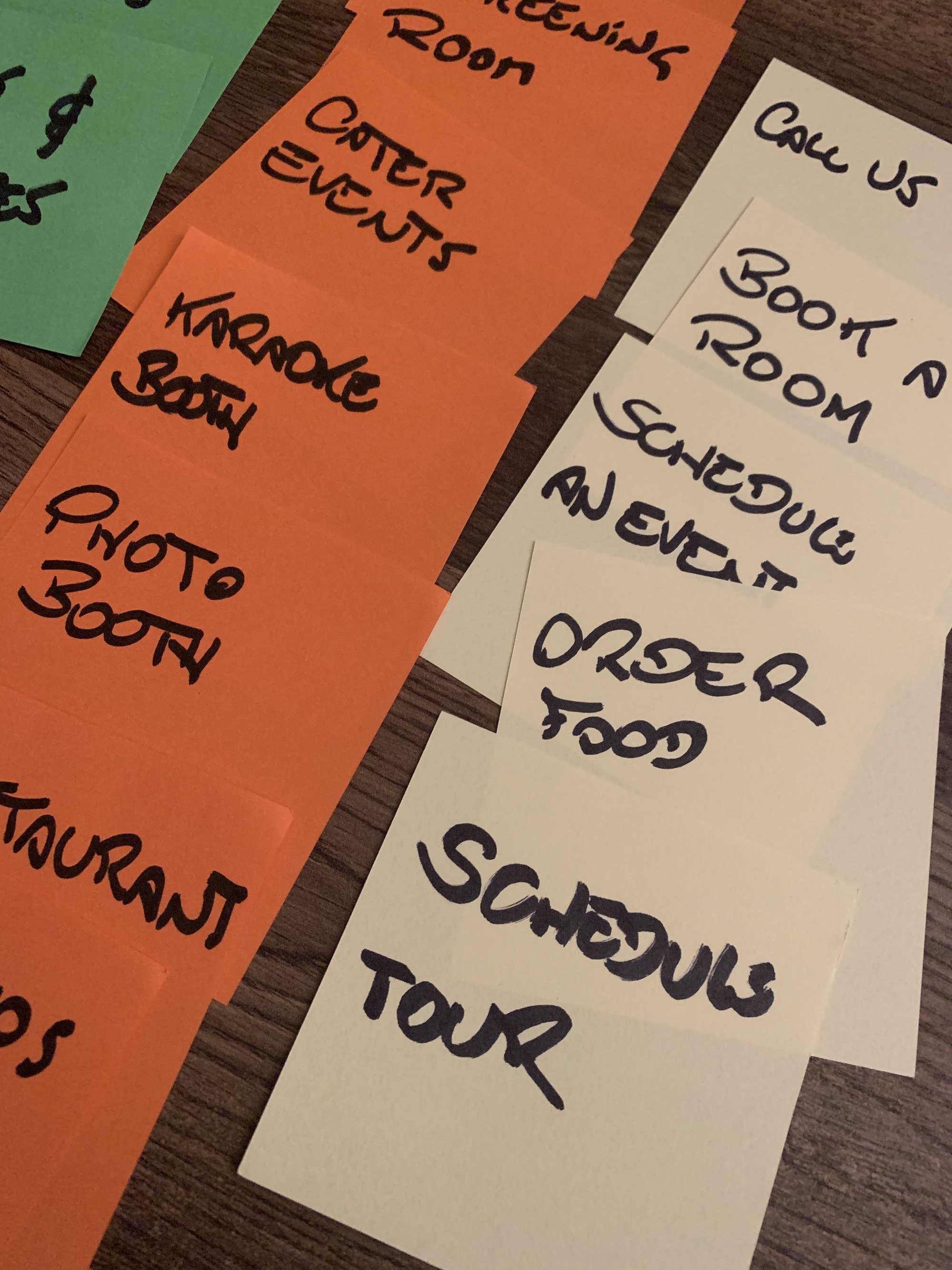
A Card Sorting exercise was done to audit internally all the different services and interactions that District 28 was able to provide.
That exercise involved different members from key teams at District 28 and we managed to categorize the items in buckets that later became the sub-brands and powered the creation of the Digital environment
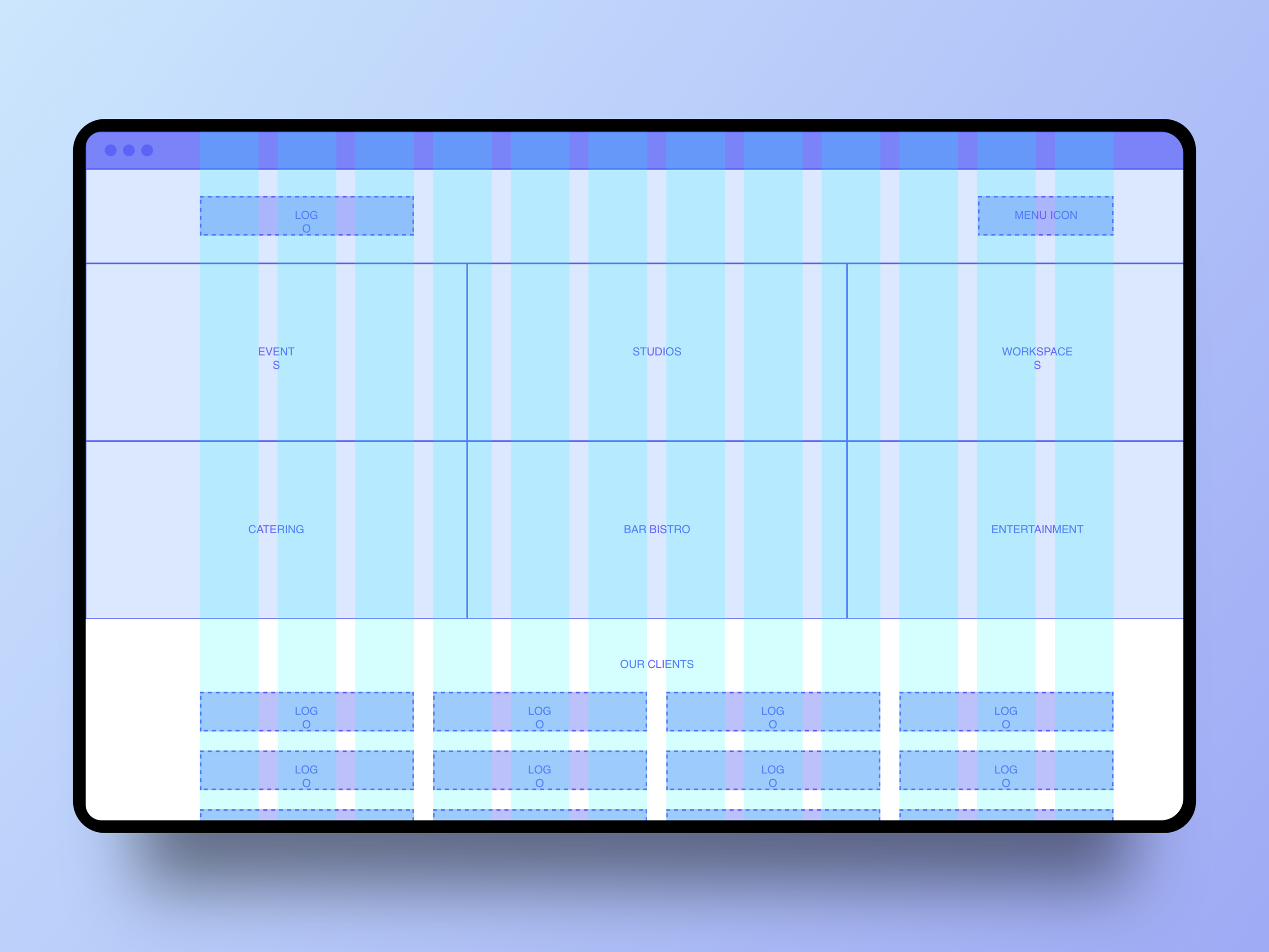
Information Architecture

Once we finished with the process of identifying what would be the "big" services and organize them into categories. Establishing an Information Architecture tree was the next natural step. With that out of the way, we could move on to create the journeys, flows, and wireframes
Branding and Visual Identity
It was now time to start creating their Visual look and feel. The venue had some interesting features: industrial, clean, exposed bricks, and we started by gathering those visual cues. From that process, the logos and the visual identity were born.

Moodboard

Logos for all the brands under District 28
Wireframing
With more understanding of the brands and the user navigation on digital, we were able to start establishing the look and feel. I always prefer to start with wireframes as a way for stakeholders not get stuck on Visual and focus more on the capabilities of a page instead.

Validate
The Wireframes were vital to start creating a Visual presence online. Once the Design started to get more close to a high-fidelity interface, I created a sandbox where a fully-functional website was developed to facilitate the usability testings I wanted to perform with real customers on-site
User Flows


The results
I tried to use metrics to help understand Customer engagement with District 28's websites
District 28 Workspaces
District 28 WorkSpaces is ranked as one of the first options in search engines on this subject. Occasional mentions on blogs and magazines enabled the company to move from a total of approximately 10% capacity to 100% spikes in a 6-month period, making them opt for opening more coworking office on the spot.


District 28 Events
The Events division also had a very interesting performance. Large companies were choosing the establishment to advertise their products and expose their materials. One of the biggest case of success was the presentation of the Pixel 2, by Google, while simultaneously connected to the product release in San Francisco.
The number of visits and goals achieved through the new websites have increased approximately 200%.
